HRWize analytics add-on feature gives you the ability to create reports.
A 'Sparkline' chart is intended to provide a visual representation of data but without axes or coordinates, legends, etc. Sparkline charts are intended to be succinct, memorable, and ideally presented close to where supporting data is available, such as an HRWize dashboard.
Sparkline charts are best suited to line and column charts. In this example, we have created a Line chart that has labelled axes, a trend line, and you can hover over a data point to see additional information:

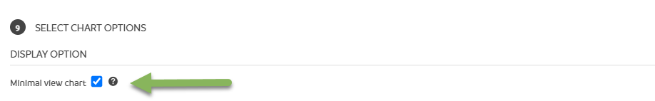
To create a new Sparkline chart or to change an existing chart to a Sparkline chart, there is one single additional option to choose from. When modifying or creating a report, select the 'Minimal chart view' option. This will override any other display options for this site:
By contrast, the Sparkline version of the same report will have none of these labels, trend lines, etc, however, you can still see additional information by hovering over any data points:

Once you have the chart in the format you want, you can add it to an existing, or create a new dashboard. Click here to read an article on creating and sharing a dashboard.
In this example, you can see the difference between a 'standard' line chart and a Sparkline chart with the same data below it. You can see the Sparkline versions of the chart can be smaller and more compact:

HRWize
Comments